Nowadays, most websites consist of Blocks. The Grid helps to structure the Content in a Block. The vast benefit of Grids is that it automatically simplifies the Mobile Views or the Responsive Modes settings. Your websites must be mobile-friendly.
We have reworked the Grid's Cols, Rows, and Gap properties, similar to those of the Grid Repeater and other columnar Elements.
Edit Grid
You can choose any Grid layout and modify its dimensions. You can resize the Grid by clicking and pulling the blue resize markers. You can also resize the Grid proportionally following the red diagonal guide.
Copy and Paste
Right-click the Block marker and select the Copy option from the Context Menu.
You can also press the "CTRL + С" hotkeys.
Select the destination Block.
Right-click and select Paste from the Context Menu or
Press the "CTRL + V" keys to paste.
Align the Grid.
Delete Grid and Block
Select the Grid and
Click the "Delete Grid" button in the Property Panel, or
Press the DELETE key.
Edit Grid Cells
Select the bigger cell to the left.
Change the Image Fill to Color Fill in the Property Panel.
Copy this cell by dragging it over another, holding the CTRL or AlT key.
Swap Cells
Select a cell and drag it over another without pressing any keys. The cell Content is also moved.
Resize Cells
Resize the cell by pulling the bar markers on the cell borders.
Hide Cells on Devices
You can hide the cells for Tablets or Phones. Enable the Hide On property in the Right Panel. Then click the Tablet and Phone icons to hide this cell for those Mobile Views.
Responsive Modes
Change the cell fill to white by selecting the color in the small toolbar above the cell. Change the background image of the first cell. As stated before, grids' massive benefit automatically makes your web Block and pages mobile-friendly.
Preview
Click the Preview. Click the Device Icons in the Quick Preview.
## Summary
- Overview
- Video Lesson
- Cols, Rows, And Gap Properties
- Responsive Modes
## Overview
Nowadays, most websites consist of Blocks. The Grid helps to structure the Content in a Block. The vast benefit of Grids is that it automatically simplifies the Mobile Views or the Responsive Modes settings. Your websites must be mobile-friendly.
!responsive.jpg!
## Video Lesson
<iframe width="600" height="330" src="https://www.youtube.com/embed/B-r_QVXHJ5U" title="Video Lesson: Grid Element" frameborder="0" allow="accelerometer; autoplay; clipboard-write; encrypted-media; gyroscope; picture-in-picture; web-share" allowfullscreen></iframe>
[More video lessons](page:1318)
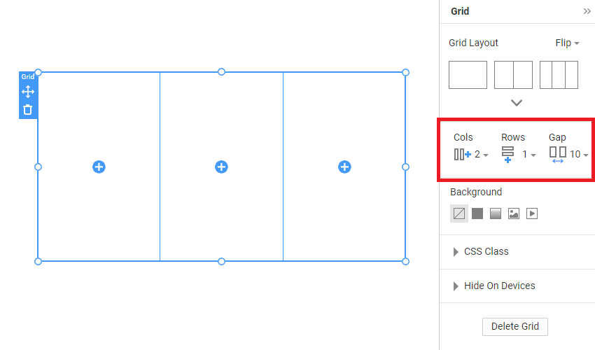
## Cols, Rows, And Gap Properties
We have reworked the Grid's Cols, Rows, and Gap properties, similar to those of the Grid Repeater and other columnar Elements.
!grid-cols-rows-gap.png!
## Edit Grid
You can choose any Grid layout and modify its dimensions. You can resize the Grid by clicking and pulling the blue resize markers. You can also resize the Grid proportionally following the red diagonal guide.
### Copy and Paste
1. Right-click the Block marker and select the Copy option from the Context Menu.
2. You can also press the "CTRL + С" hotkeys.
3. Select the destination Block.
4. Right-click and select Paste from the Context Menu or
5. Press the "CTRL + V" keys to paste.
6. Align the Grid.
### Delete Grid and Block
1. Select the Grid and
2. Click the "Delete Grid" button in the Property Panel, or
3. Press the DELETE key.
## Edit Grid Cells
1. Select the bigger cell to the left.
2. Change the Image Fill to Color Fill in the Property Panel.
3. Copy this cell by dragging it over another, holding the CTRL or AlT key.
### Swap Cells
Select a cell and drag it over another without pressing any keys. The cell Content is also moved.
### Resize Cells
Resize the cell by pulling the bar markers on the cell borders.
### Hide Cells on Devices
You can hide the cells for Tablets or Phones. Enable the Hide On property in the Right Panel. Then click the Tablet and Phone icons to hide this cell for those Mobile Views.
## Responsive Modes
Change the cell fill to white by selecting the color in the small toolbar above the cell. Change the background image of the first cell. As stated before, grids' massive benefit automatically makes your web Block and pages mobile-friendly.
## Preview
Click the Preview. Click the Device Icons in the Quick Preview.
## Learn More
- [Responsive Design with Nicepage](page:5249)
- [Menu](page:9801)
- [Box](page:13180)
- [Block](page:18664)
- [Video Tutorials](page:1318)
- [YouTube Channel](https://www.youtube.com/playlist?list=PLrT1zCpaZbn5Td7n67dcjue4nba8VD9hh)
##